Buy gold online - quickly, safely and at low prices
Showing posts with label Chart. Show all posts

Friday, December 11, 2009

2 Developing Gold and Silver Stocks

And a Look at the Life of a Gold Company

By Greg McCoach
Friday, December 11th, 2009

It's arguably one of the most profitable secrets to investing in gold stocks...

A pattern of rapid growth found repeated in the early lives of today's most successful gold companies can be the key to guaranteed gains.

And it all starts to become clear when you take a closer look at the...

Life of a Successful Gold Company

The early lives of successful gold stocks correspond to the three general stages of any growing natural resource company: Discovery, Development, and Production.

Advertisement

Bull Market. . .

Bear Market. . .

It doesn't matter!

No matter which way the market is heading, this is the only place to land

20 double-digit gains in one year - GUARANTEED!

Click here now. . .


In today's market, a new gold company will normally start off quite small when it first goes public. It will typically have a handful of unexplored gold prospects with a focus on one or two.

During this discovery stage, a gold company will conduct extensive field exploration on prospective mineral projects to identify and prove the existence of a significant gold resource.

Life of Gold and Silver stocks

If a gold company makes a sizable discovery on one of its properties, speculation can send share prices soaring by hundreds — or sometimes even thousands — of percent in short order.

But as the initial excitement is quieted, the stock tends to pull back and stabilizes as the company develops the discovery into a producing gold mine.

This development stage can be a long and difficult — and sometimes boring — process. But it can also one of the most profitable times to be an investor.

The best time to buy gold stocks has historically been in the mid- to late development stage. At this point, the exploration risk has been essentially eliminated, while upside potential is maximized from near-term production earnings and future growth.

A successful gold company will eventually achieve positive cash flow and use it to expand operations and increase production for continued future growth. This growth creates new earnings that continue to propel share prices sharply higher.

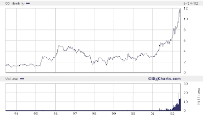
A great example of this model is GoldCorp (NYSE: GG, TSX: G). Take a look at shares of GoldCorp as the company made their first big gold discovery:

Goldcorp - Bigcharts.com

In 1994, GoldCorp acquired the Red Lake historic gold camp. After several months of exploration, the company reported a significant gold discovery from drilling nine holes that averaged 311 grams of gold per tonne across two meters. Investors quickly found themselves 250% wealthier when share prices breached $5.

But the initial excitement wore off; the stock pulled back below $2 as the company went into the long and difficult development stage.

After a few years of development, GoldCorp finally began production and share prices took off. The Red Lake Gold Mine has grown to now include two operating complexes: the Red Lake Complex and the Campbell Complex. Red Lake is Canada's largest gold mine and is expected to produce over 600,000 ounces of gold this year.

The company has expanded worldwide operations to now include 11 gold-producing assets that are expected to yield 2.4 million ounces this year. Today, GoldCorp is a $30 billion company with a $40 stock. Shares of the company have yielded a 1,900% since the company began producing gold from Red Lake.

The home run gains to be made from GoldCorp may be over. But there are many other public gold companies that can be expected to follow a similar model as they take their projects through discovery into production.

The three-stage model of the life of a gold stock also generally applies to all companies involved in natural resources, including other precious metals like silver. With that in mind, I'd like to very briefly tell you about...

Two Developing Gold and Silver Stocks

Both of these companies have already made significant discoveries, which rapidly lifted their share prices. Today, both firms are working to develop their projects into economically feasible assets. Take a look:

Pediment Gold (TSX: PEZ)

Pediment Gold began drilling exploration of its 100%-owned San Antonio gold project in late 2006. Six months later, the company made a significant gold discovery when it drilled 32.93 meters grading 1.23 g/t gold and 25.1 meters grading 1.09 g/t gold. The subsequent drilling of over 200 more holes (totaling over 40,000 meters in depth), gave Pediment enough data to delineate a 1.5 million ounce gold resource.

Share prices increased as much as 600% from $0.50 to $3.50 between the time of original discovery and resource estimate. After that, share prices tapered off as the buzz from the big San Antonio gold find faded.

Pediment is currently developing the project and has recently reached a new 30-year agreement with the local government (called the Ejido) that allows Pediment to continue to freely explore the property and propose development and operation a future San Antonio gold mine.

Orko Silver (TSX-V: OK)
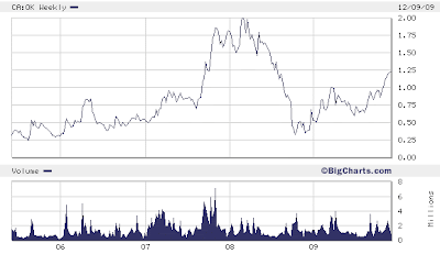

In March 2005, Orko Silver began drilling exploration on its La Preciosa silver project. A few months later, the company made a significant silver discovery when it drilled into high-grade silver grading 200 to 300 grams per tonne. After three years of extensive exploration, the company reached its goal of 100 million ounces of silver resources in March 2008.

Early investors walked away with a 700% as share prices increased $0.25 to $2.00 before falling.

In April, Orko and Pan American Silver (NASDAQ: PAAS) announced that the two companies would create a joint venture to develop the La Preciosa project. The companies are currently working together to upgrade the category of the current silver resources. This is a necessary step in completely a feasibility study to prove an economic resource.

Conclusion

My colleague, Luke Burgess, is investing in gold and silver stocks in the same way. He recently recommend a small American silver company that just started production and is expected to ramp up output by nearly 20,000% over the next 12 months.

But he's not the only one. Many of my gold and silver analyst peers are quickly moving into mid- to late development stage stocks. This is typically the period when financial institutions and major investors will begin buying a gold stock. It's when the loose money rolls out and the more steady-handed investors establish positions and volatility is decreased in share prices.

In the mid-1990s, GoldCorp proved its ability to take the Red Lake gold project all the way through the development stage into production. Early investors have been rewarded with gains of almost 2,000% since that time.

Today, companies like Pediment Gold and Orko Silver are vying to prove their ability as well. As investors, we can leverage the development of gold and silver projects by owning shares of the companies that have advanced-stage development projects.

Good Investing,

Greg McCoach
Editor, Wealth Daily
Investment Director,
The Mining Speculator
Greg McCoach's Insider Alert


YeOldGoldNugget's links of interest

Trend Analysis
Get the most recent Trend Analysis on Pediment Gold Corp. by following this link :
Marketclub - Pediment Gold Corp. Trend Analysis Marketclub - Pediment Gold Corp. Trend Analysis (What's this?)

Get the most recent Trend Analysis on Orko Silver Corp. by following this link :
Marketclub - Orko Silver Corp. Trend Analysis Marketclub - Orko Silver Corp. Trend Analysis (What's this?)

Friday, December 4, 2009

The Good, The Bad and The Ugly

Let me start off this article by introducing to you, Clint Eastwood as Blondie. The Good, a.k.a. the Man with No Name, a subdued, cocksure bounty hunter who competes with Tuco (The Ugly) and Angel Eyes (The Bad) to find the buried gold.

Blondie and Tuco have an ambivalent partnership. Tuco knows the name of the cemetery where the gold is hidden, but Blondie knows the name of the grave where it is buried, forcing them to work together to find the treasure. In spite of this greedy quest, Blondie's pity for the dying soldiers in the chaotic carnage of the War is evident. "I've never seen so many men wasted so badly," he laments.

Coincidentally in my story to drive the point home, Blondie aka The Good is represented by the HUI Index and the Gold Spot charts while Tuco aka The Ugly is represented by the Dollar. Blondie and Gold...that can't be a coincidence. Gold vs The Dollar. Anyway, beneath each chart I will try to explain why I believe the chart belongs in either The Good, The Bad 'or' The Ugly.

The Good

HUI Index Daily Chart
HUI Index Daily Chart December 04, 2009
Chart is courtesy of marketclub.
Marketclub - HUI Index Trend Analysis Marketclub - HUI Index Trend Analysis (What's this?)

Gold Spot Daily Chart
Gold Spot Daily Chart December 04, 2009
Chart is courtesy of marketclub.
Marketclub - Gold Spot Trend Analysis Marketclub - Gold Spot Trend Analysis (What's this?)

Why classified under The Good? Just take a look at the HUI Index chart, take a look at the steady rise never failing to break from beyond its original trend channel from where it started early on in January 2009. Not only that, this week we came $2 dollars short of reaching the all time high. I'd say that qualifies as strong performance. The failing to break the all time high is like I said, just that, stocks don't have to break all time highs in one straight move. Maybe one, two or three attempts.

At least that index managed to get back to earlier highs.

Now on to gold...do the terms 'historic gains' mean anything? I don't really mind the little bumps or a possible correction, what must be done must be done. Like with the HUI, this will just be a correction, not the start of golds downward march to 984.

The Bad

S&P Daily Chart
S&P Daily Chart December 04, 2009
Chart is courtesy of marketclub.
Marketclub - S&P Index Trend Analysis Marketclub - S&P Index Trend Analysis (What's this?)

Nasdaq Daily Chart
Nasdaq Daily Chart December 04, 2009
Chart is courtesy of marketclub.
Marketclub - Nasdaq Trend Analysis Marketclub - Nasdaq Trend Analysis (What's this?)

Dow Jones Daily Chart
Dow Jones Daily Chart December 04, 2009
Chart is courtesy of marketclub.
Marketclub - Dow Jones Index Trend Analysis Marketclub - Dow Jones Index Trend Analysis (What's this?)

So, The Bad! What do these charts have in common? They all to me at least, show choppy performance, failing to reach earlier highs is one. Second is, they are all showing signs of a market in disarray. A market in doubt. Will it go higher or will it go down? A market that is tiptoeing along...every leaf, twig or little pebble will set off the noise and release the evil bloodhounds...leaving everybody running for the exits...so to speak.

Angel Eyes / The Bad / Lee van CleefMethinks, the debt package and stimulus money is running out...nothing like an inflated job report to try to stave off any possible drop. However, there is more needed than an inflated job report to continue this path.

I'm not convinced. I'd be careful, that's all. The Dow Jones even has a rising wedge in there which if confirmed does not bode well.

The Ugly

US Dollar Daily Chart
US Dollar Daily Chart December 04, 2009
Chart is courtesy of marketclub.
Marketclub - US Dollar Trend Analysis Marketclub - US Dollar Trend Analysis (What's this?)

On to the almighty Dollar, the greenback, the world-currency, the safe-haven,...at least, that is what it once was known as.

Tuco / The UglyAlmighty? NOT compared to what I can see from other currencies!
Greenback? Last time I checked they were still green.
World-currency? NOT for long!
Safe-Haven? NOT what I can see from gold's chart.

Summary

Now, I'm not per definition saying the markets are going down but I'm just stating and showing you what is on the charts. If they break those resistances then fine, none the wiser and we move on. However, if there does seem to be a reversal going on, then people and investors will, like they did before, take the money off the table. Will that money then go to the dollar or the treasuries...or will that money flow into gold, silver and the commodities?

We all know who came out on top in the movie,...don't we?


YeOldGoldNugget's links of interest

Wednesday, December 2, 2009

Gold's Relentless March Continues!

Gold Spot Daily Chart
Gold Spot Daily Chart December 02, 2009
Chart is courtesy of marketclub.
Marketclub - Gold Spot Trend Analysis Marketclub - Gold Spot Trend Analysis (What's this?)

Since I did my last chart I've been doing some minor adjustments to my trend lines. Only minor ones as you'll see. Just compare the two daily charts for a moment.

Only difference is, the trend lines now align perfectly and every other one is 50 points away from the next one. I don't know whether this is a coincidence to have them lining up so perfectly but there are too many points to highlight on the chart which sorta rules out coincidence...at least to me.

For instance...the bottom trend line started November/ December 2008 at around 750 (low to be exactly 756,20 at December 07, 2008). Were we to follow that trend line until now we would indeed with the combined normal trading action have hit the 1000 mark around September / October 2009.
Also from the chart you will see the upper trend line being hit in February 2008, on February the 20th to be precise. If I use that high and draw a new trend line parallel with my other trend line and also at exactly 50 points from the lower one (the 4th), take a look where gold took a breather from a couple days ago!

On November the 24th I posted an alert on my stock-house blog to let my readers know that a possible dip was coming. You can now see why!

Sure, it could break the upper trend line straight away but always better to take some profits off the table. That way you have some funds available to buy stocks on the low if it does turn down.

On with the chart, you'll see that from the beginning of November gold has broken through several trend lines, three to be precise. Now, if you know that each channel represents 50 points than that gives you 3 x 50 which equals 150 points increase already since the beginning of November when we were still trading at 1050.

So, starting from 1050 in early November, 3 channels up gives us 1200. Now from the chart you'll clearly see that it broke short of the 1200 and after hitting 1195 started trading down. It was a quick pullback which coincided with the Dubai debt issue seemed like a very violent correction as it went down and hit a low of 1136, a little bit under the lower trend line. Gold was quickly brought back up again and together with the 10 MA as support was quickly making its way to the upper most trend line again and has since yesterday clearly broken it.

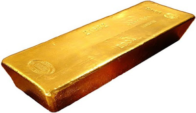
Gold Bar - BullionVaultTrading now around $1215, so definitely above the upper trend line which sorta leaves me wondering where this is going to end? In my last article I indicated getting to 1200 would be no problem. From the looks of things I'd say no problem indeed!

So now what?

Well, from the chart you'll see already on the daily we are a whopping $232 away from the Moving Average 200 ;-)
Don't know if this is a record or not since my charts only go back for 10 years but from what I can see on the daily in those 10 years....IT IS!!!

Does that mean I'm now looking downwards for gold? HECK NO!

No time to be betting against gold right now, no matter what RSI or MA tells you. At least, that's what I think. If mean, if you see gold moving up channel after channel, gaining 50 points in a couple of days and another 100 points over the course of less than a month with no signs of even looking back to the carnage it is wreaking havoc upon amongst those who are short.

Golden HAVOC!

So, does the daily chart please YeOldGoldNugget? A WHOLEHEARTEDLY YES! It is the relentless action of gold, the maybe historic gains gold is making now. Not simple factors to ignore, my 2 gold nuggets.

Gold Spot Weekly Chart
Gold Spot Weekly Chart December 02, 2009
Chart is courtesy of marketclub.
Marketclub - Gold Spot Trend Analysis Marketclub - Gold Spot Trend Analysis (What's this?)

Weekly is where gold does its magic! Is it magical? Well, can't you see the magic going on in the weekly chart? I sure can!

Again, mind you, I can only look back 10 years in market club and from what I can see gold has never seen such strong performance like it has these last two months. Absolutely amazing to say the least!

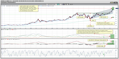
From the chart you can see we are still or could still be completing our head and shoulders pattern which we broke out off from the beginning of October 2009, That alone gives us a long term price indication of about 1300 to 1350.

Looking at the MACD,...if ever someone needed to write a book and describe one of the most bullish of MACD's then surely gold's MACD or something similar would be shown. Blue line above red line, wide gap ever increasing, steady increase is also shown in the gray divergence cubes which increase steadily over time. That is just what one needs to see and will always see when a stock or index is undergoing a strong uptrend.

I've added another indicator, the Average Directional Index, this can determine trend strength regardless of the market direction. This non-directional oscillator is based on a range of 1 to 100 (although movements over 60 are rare). If the line is under the 20 mark, the trend is considered to be weak. If the line is above the 40 mark, the trend is considered to be strong. The ADX line is built on the results of two separate technical indicators, the +DI (force of up-moves) and the –DI (force of the down-moves). The default for this study is 14 periods which takes into the consideration the measurements of the +DI and –DI for the last 14 periods.

Knowing that and looking at gold's ADX chart you can clearly see the +DI above the ADX which indicates a trend upwards. ADX is also looking to go higher.

Gold Bar - BullionVaultIf gold keeps up its relentless action which it, looking at the weekly chart, is bound to do then by February 2010 we might already be looking at 1300 or more.

Stranger things have happened.

I think we have a clear winner here! Gold...and silver...bound to astonish most and catch many off-guard and with their pants down.

To finish my article I'll give a couple supports daily and weekly.

On the daily we have support from either the 10 MA at 1184, the 30 MA at 1129. I'm disregarding the 200 MA (984) for obvious reasons. Of course, there are also the trend lines to look for to offer support, 1200, 1150, 1100,...

On the weekly we have support (and also from the trend lines) from either the 10 MA at 1096, the 30 MA at 1002. I'm disregarding the 200 MA (788) for obvious reasons.


YeOldGoldNugget's links of interest

Tuesday, November 24, 2009

Orko Silver Chart November 24, 2009

Orko Silver Daily Chart
Orko Silver Chart November 24, 2009
Chart is courtesy of marketclub.
Marketclub - Orko Silver Corp. Trend Analysis Marketclub - Orko Silver Corp. Trend Analysis (What's this?)
The daily chart now shows in clearer detail the breakout which happened on November the 16th. If you take a look at the volume chart you'll see that volume has been steadily building up since the start of this rally November the 10th. On and off we've seen 353K, 402K, 545K and 732K shares being traded with the larger volumes being seen since breaking resistance at 1.00 at November the 16th.

When I take a look at the Moving Average Convergence Divergence (MACD) you can see we've had the bullish crossover a couple of trading days ago and we are still up-trending. There is as of yet no sign of any reversal showing up on the daily. (Divergence still positive)

Relative Strength Indicator (RSI) is now just about getting back at the start of being overbought. I say, at the start cause even on the daily chart Orko as we can see from the rally from early September, Orko can stay in the overbought zone for a prolonged time. We are now only a couple days in overbought so still nothing to worry about as far as I'm concerned.

Orko Silver Corp - Developing one of the world's largest Silver deposits
Trading action today again very solid. To most it will seem just like 200K shares traded but take a look at the orders which weren't filled so today again very solid action.

Most juniors were trading down and Orko was trading up and managed to close at 1.18+0.04 (3.51%). All in all still very pleased with the action going on in Orko. What does one need more, this has it all for the short-term trader AND for the long-term trader. For a short-term trader, just take a look at the chart, buy early September, get out September 25, get in early October, get out late October,...

Orko Silver Weekly Chart
Orko Silver Chart November 24, 2009 (Weekly)
Chart is courtesy of marketclub.
Marketclub - Orko Silver Corp. Trend Analysis Marketclub - Orko Silver Corp. Trend Analysis (What's this?)
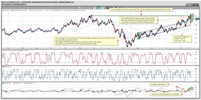
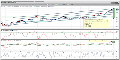
On to the weekly where we try to spot the expected longer term trend. From the weekly you'll see on the MACD chart that we are only since the start of October trending above the MACD center line. That fact and the fact that we are trading above all Moving Averages bodes well for Orko long term.

Also from the chart you can see the resistance line I've drawn at 1.00 and the bottom at around 0.80. The 1.00 seems pretty clear to me. The 0.80 is found by looking at the 200 MA, you'll see that from the start of the big drop from April 2008 to about September 2008, there is some sideways action going on around 0.80. Besides this, getting under 0.80 there would mean going under the 200 MA. The 0.80 has acted as support and resistance before.

Placing some Fibonacci retracement lines on the chart from our high of about 2.00 and our low of 0.28 gives us 1.14 as another key point as this coincides with the 50% Fibonacci. Fibonacci wise our next target should be 1.34.

Would be a very hard feat for YeOldGoldNugget to describe these charts as being bearish in nature if not near impossible.

This Bull has HornsNope, this bull has horns and some very nice ones mind you. Should be clear to individuals, funds and computer programs that Orko is trading up from here. With Pan American Silver again stating very clearly to have a production decision ready on La Preciosa by the end of 2010 I do not think I need to draw a little picture for visual purposes as to where this thing is going to go...do I?

I think most can do their own maths on that. Here's a little blast from the past and from when I just started up my blog on Orko. Doesn't the low seventies sound cheap now? Back then it probably wasn't to most. That is why it is so important to do your own due diligence, find a stock which you like, with decent management, approachable to shareholders, valid track record, good project(s), plenty of funding, interest from junior/senior...AND STICK WITH IT!

That would be my advice anyway as a long term holder. For the surfers amongst us, please ride the long waves only, don't bet against our precious Orko by going short. That is bad JuJu! The market will punish you for it I'm sure.

I think that's about all I have to say for the moment about Orko. One more thing though, I was going to do a gold chart but time is short so this will have to wait till tomorrow. Only two things I have to say right now, never a bad idea to take some profits off the table and also never to go against the trend. Though I recognize the overbought and the big rally without correction I still find it extremely dangerous betting against this rally. More on that tomorrow.


YeOldGoldNugget's links of interest

Wednesday, November 18, 2009

Gold Continues its Upward Move to 1350

Gold Spot Daily Chart
Gold Spot Daily Chart November 18, 2009
Chart is courtesy of marketclub.
Marketclub - Gold Spot Trend Analysis.

OK. Here it goes :

Beginning October 2009 I did my buy gold now article. Gold was then still trading around 1010. Next days trade gold made a high of 1043....and continued going higher.

At the end of October 2009 I wrote G for gold and back with a vengeance article. Gold was at that time trading around 1040 and had just consolidated back to the second trendline. Next days trade gold made a high of 1066 and continued going higher.

Beginning of November 2009 I wrote my gold breaking out of upper trend channel article. Gold was at that time trading around 1096. Next days trade we hit a high of 1110 and continued going higher.

Gold Bar with Coins - BullionVault.comNow, I'm not trying to say that you can draw a trend line along YeOldGoldNugget but from time to time one has to contemplate and look back upon one's own writing. Is YeOldGoldNugget full of crap, just plain lucky,...or can YeOldGoldNugget follow Gold Nuggets?

Well, that is not for me to decide, I'd probably just go with the full of crap.

So,...what does YeOldGoldNugget think now? Hm? I'm probably way too bullish for my own good but I see 1200 being doable...short term. However, I have to say my short term judgment is a bit clouded by me having looked at the weekly chart. The daily I'd say,...bit of danger here. Well, to me, and to the trend line I've drawn, we are again reaching a crossing point. Will we break that trend line and continue heading further up or will gold do a short term pullback?

Hard to say. Fundamentally I'd say we go straight to 1200 and more, however the daily chart tells me gold is due for a small pull back. If you look at the daily chart you'll notice that gold does not stay for very long in the oversold zone, RSI wise then. So based on that, I'd say we could get a pullback in the very near term.

How far a pullback you say? Well, when we drop to trend line 2 then I'm looking at somewhere around 1084. This also coincides with the 30 Moving Average which together with the trend line can or will act as support.

Don't forget! When we are in a strong uptrend its always a rather dumb idea to be betting against the flow. Same as jumping in front of a moving Silver Train like Orko Silver Corp, thinking it will stop just because you expect it to or so desire it to. That Silver Train, like gold, has left the station. So, in gold's case you're thinking about going short gold then better make sure it's a quick trade cause else you're going to loose more than just your shirt.

Gold Spot Weekly Chart
Gold Spot Weekly Chart November 18, 2009
Chart is courtesy of marketclub.
Marketclub - Gold Spot Trend Analysis.

On to the weekly for direction and confirmation of our trend. Up or down? Stupid question I suppose...well...for the intellectually challenged maybe a solid question?

Time to get the neon signs back from under the dust again. One shows how YeOldGoldNugget feels about the weekly chart and the other gives a visual indication of the trend.
YeOldGoldNugget is VERY VERY VERY HAPPY with the Weekly ChartUp
What more does one need to know?

OK then, MACD looks good and is making higher and higher high's which is extremely bullish. Stochastics has been trading for a little over 2 months in oversold zone. As you can see from the chart, the last big rally got gold trading in oversold area for as much as 7 months! YOINKS!

RSI is not the best of indicators to use when looking at the weekly chart of gold, with that I mean, don't go opening a weekly chart, seeing gold in oversold at RSI and deciding to dump your shares or something like that :-)

Better is it to watch stochastics...when this goes to far towards 60 then I'd start contemplating about selling or taking profits. That is, if you're riding the waves like I am.

Surf's up!


So to round up :

Entering now, probably not THE best of idea's, better wait to see if gold will break this trend line. If in the next days you see gold moving up to 1150, 1155, 1160,...then its a fair bet that 1200 will be knocked down in the very same breath. Remember also that gold could be finishing the Head and Shoulders pattern which has a target of 1350

If you from now see gold opening lower, closing lower, lot of red candles, bit of sideways trading without making new higher grounds than the air is out of the balloon and we need a refill. You'll know and recognize it when it happens. This thus could indicate gold wanting to trade lower and possibly heading back to trend line 2.

Just wait and let the market come to you. Clearly the trend is up, but short term there could be danger ahead. Last thing, the dollar seems to be caving in under the enormous buying which has been going on in the gold market. A high gold price does not bode well for the dollar and looking at the weekly chart of gold and seeing where this could go...not a far stretch of the imagination to think what will happen with the dollar when gold is trading at 1350.


YeOldGoldNugget's links of interest

Wikinvest Wire


Watch INO TV for FREE now.

Orko Silver Corp. Chart


MarketClub Free Trial - Tools for the Trader

24 Hour Spot Silver (Bid)

Live 24 hours silver chart [ Kitco Inc. ]

Buy Gold Online - BullionVault

Buy gold online - quickly, safely and at low prices

Educational Videos - Market Analysis

Watch the latest educational videos from MarketClub by Adam Hewison