Buy gold online - quickly, safely and at low prices
Showing posts with label Trend. Show all posts

Tuesday, December 29, 2009

The Dollar's Demise and Gold's Resurrection

The Dollar Consolidates while the Markets recover.

US Dollar Daily Chart
US Dollar Daily Chart December 29, 2009
Chart is courtesy of marketclub.
Marketclub - US Dollar Trend Analysis Marketclub - US Dollar Trend Analysis (What's this?)

Here is a short follow up on my most recent article 'US Dollar Extends Gains' written on December the 22nd. In that article I summarized the following :

To summarize, short term, yes we are in an UP trend, the chart confirms that. However, RSI has reached overbought. MACD is trending higher but with choppy performance. We are trading farther and farther away from the 30 and 50 MA so a consolidation is getting more and more likely to happen from here.

Mr. market was soon to follow this advice cause December 23 was the start of the consolidation/correction for the dollar after extending its gains from a low of 74.356 on December 2 to a high of 78.449 on December the 22nd.

Moving Averages

10 MA : 77.784
30 MA : 76.349
50 MA : 75.916


As of writing the dollar is trading at 77.388 and is thus already trading below the 10 MA. December 27 saw us crossing below the rising trend line indicating that the steam is out of this kettle for sure!

Looking at the chart and all indicators I reckon looking up from here is wishful for those who are long dollar but not very realistic. Down is where I would look. Short term and long term. Market manipulation excluded then cause I am no match for that.

I say manipulation because if you have a look at the charts from Early December and in particular December the 2nd. The dollar starts to rise and right at that time gold starts to drops. Now, OK, I can understand all the dollar/gold relation and safe haven and such...

...but what I do not get is why even after having such a crisis, after knowing what the dollar is worth now or actually ISN'T worth after the stimulus packages, TARP, FED printing presses, Bank bailouts, Company bailouts,...investors are still buying dollars. So...who are these very first buyers driving up the price and starting this Christmas rally in the dollar?

This is no rally based on valid fundamentals. NO Sirree!

So, let me see if I understand Mr. Market? Ok?

So, December 2, gold breaks down and the dollar rallies or vice versa, the dollar rallies and gold breaks down. So, later we get word from the European mainland that Greece, Spain and Ireland are in deep...um...horse manure? Is that the right noun to use? Up to their arm pits in the proverbial debt-pit.

The Dollar's Demise - A full motion picture DocumentarySo, because the Euro takes a beating, the dollar who for months has had the leading role in our documentary as being the biggest decliner now steps aside and lets the euro play leading role for a while?

Hm? What does not sound right in this motion picture?

This sounds to me like too much artistic freedom on behalf of the director of this documentary. My original remarks remain, unless the dollar succeeds to AND close above 80.00 and STAY above 80.00 the dollar is in my books at least very much in a downward trend.

US Dollar Weekly Chart
US Dollar Weekly Chart December 29, 2009
Chart is courtesy of marketclub.
Marketclub - US Dollar Trend Analysis Marketclub - US Dollar Trend Analysis (What's this?)

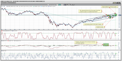
Weekly then, well this hasn't improved much. I'm still not swayed, not even by the rally we had since the start of December. It is still too insignificant a move to even be treated as such. For me, I would stay far far far away from any long positions in the dollar for the moment.

From the MACD indicator we can see this is still clearly trending below the center line and thus still bearish as indicator. Histogram is also declining.

Dowsing Rod - Image from http://skepticreport.com/sr/?p=564The ADX or Average Directional Indicator is in some sort of limbo on the weekly chart? Don't know if this is a chart bug or if the -DI and the +DI just happen to run parallel for the last couple of days.

Maybe it is forming a wishing rod and hoping then to break it in the right place and have their wish come true? Who knows?
Maybe even a dowsing rod? Searching for water? No,..must be an oil dowsing rod then.

Anyway, until this market takes direction again ADX is probably not a good indicator here on the weekly besides than the fact that we see that there is some sort of sideways action to expect perhaps.

Long term like I said, until we clearly break above 80.00 I consider the trend which was downwards still very much intact. Despite the short rally.

I don't know how many more lessons Mr.Market needs but sooner or later this dollar/gold relation will be gone and out the door for GOOD!


YeOldGoldNugget's links of interest

Tuesday, December 22, 2009

US Dollar Extends Gains

The Dollar Increases on the Euro's Decline.

US Dollar Daily Chart
US Dollar Daily Chart December 23, 2009
Chart is courtesy of marketclub.
Marketclub - US Dollar Trend Analysis Marketclub - US Dollar Trend Analysis (What's this?)

I'll just do a quick run down on the chart.

I've added the ADX chart. Again on the ADX for those who have not used this indicator before, the Average Directional Index can determine trend strength regardless of the market direction. This non-directional oscillator is based on a range of 1 to 100 (although movements over 60 are rare). If the line is under the 20 mark, the trend is considered to be weak. If the line is above the 40 mark, the trend is considered to be strong. The ADX line is built on the results of two separate technical indicators, the +DI (force of up-moves) and the –DI (force of the down-moves). The default for this study is 14 periods which takes into the consideration the measurements of the +DI and –DI for the last 14 periods.

Dollar FanKnowing that and looking at the chart, you can clearly see that the -DI has had the upper hand for most of the year since March 2009. That changed however early December when the dollar started rallying on the very bad news that was coming out of Europe and in particular from Greece, Spain, Portugal and Ireland.

Have a read through following article.

The MACD or Moving Average Convergence Divergence is clearly trading upwards and on the daily trading above the center line. It has not been above the center line since March 2009. So daily and thus short term the trend is UP.

RSI or Relative Strength Index has reached the overbought zone.

To summarize, short term, yes we are in an UP trend, the chart confirms that. However, RSI has reached overbought. MACD is trending higher but with choppy performance. We are trading farther and farther away from the 30 and 50 MA so a consolidation is getting more and more likely to happen from here.

US Dollar Weekly Chart
US Dollar Weekly Chart December 23, 2009
Chart is courtesy of marketclub.
Marketclub - US Dollar Trend Analysis Marketclub - US Dollar Trend Analysis (What's this?)

MACD, well we are still trading below the center line which confirms that weekly we are still not out of the woods yet. The histogram however shows a nice steady increase, one which qualifies as being strong and steady.

Cash rollRSI is hovering around 50 which leaves plenty of room either UP or DOWN.

From earlier on in the article you already read about the ADX indicator. Well, then you know that the blue line does not tell you anything about the direction but merely the strength of the trend. Our blue line thus was increasing from March 2009 until the beginning of December 2009. Now because the dollar was dropping since March our blue line thus indicated that there was a strong DOWN trend.

Now that we see the ADX bending down and going lower we can thus assume that the strength of the down trend has decreased.

The +DI however was trading upwards but has now flattened out so I will have to wait and see if we get any higher beyond from where we are now.

From the chart we also see that we are now trading above the 10 and 30 MA on the weekly. That still leaves us the 50 MA at around 80.56. Until we have clearly taken out the 80.00 there is no difference to the long term trend...which is still DOWN by the way.


YeOldGoldNugget's links of interest

Thursday, December 17, 2009

Free Email Trading Course

MarketClub - www.ino.comAgain, a lot of new readers with perhaps a lot of questions about the terms I use when I do my charts and what to look out for. Here is the article with the email trading course sign up from MarketClub which highlights most of these points. Have a read and see if it is anything which might add to your trading skills. There is an unsubscribe link when you are done which works by the way. Anyway, here is the article :

First of all I want to thank you for having me as a guest today!

My name is Adam Hewison. You might want to Google Me to confirm what I am about to share with you.

There are plenty of people out there that create 'exclusive email courses' with little or no credentials to actually backup their teachings. So, I think it’s right that I share a little bit about myself with you before we even start.

I was a former floor trader on the IMM, IOM, NYFE and LIFFE as well as a risk manager of a large, multinational corporation in Geneva, Switzerland. I also have written books on forex trading and trend following. In 1995, I founded INO.com and later co-founded MarketClub. I’ve been in the trading biz for over three decades and have seen it all. I created this course as a way to give back and share trading tips and techniques that I still use in my trading today.

In my Free Mini Email Course, I will show and explain the tools and strategies you need to increase your success rate in the marketplace.
  1. The importance of psychology in price movement
  2. How to spot mega trends
  3. Understanding of technical price objectives
  4. How to picture price objectives
  5. How to trade with moving averages
  6. How to use point and figure trading techniques
  7. How to use the RSI indicator
  8. How to correctly use stochastics in your trading
  9. How to use the ADX indicator to capture trends
  10. How to capitalize on natural market cycles.
Plus, you will you will learn all about fibonacci retracements, MACD, Bollinger Bands and much more.

Just fill out the form and we’ll get you started right away.

Every success,
Adam Hewison
President, INO.com & Co-Creator, MarketClub

MarketClub - Free Trading Videos

Tuesday, December 15, 2009

Will Silver Bounce Back Before Christmas?

Silver Spot Daily Chart
Silver Spot Daily Chart December 15, 2009
Chart is courtesy of marketclub.
Marketclub - Silver Spot Trend Analysis Marketclub - Silver Spot Trend Analysis (What's this?)

I'm looking at the daily chart here, December the 15th on our 349th day of the year with only 16 more to go before we take silver into 2010.

Now, looking at the daily chart, I must honestly confess, I've seen better. Yes, at December the 11th we've hit a new 3 week low of $16.91. Yes, we have been trading down from our high of $19.45 which was put on the boards at December the 2nd and have traded down from then. Yes, we are trading below our Moving Averages.

However, to me, that only shows that we could be very near a turning point which does not mean I'm indicating a bottom here. Don't get me wrong, what I'm saying is, the market could find a bottom here. Like me, others look at the same charts and find the same lines, resistances, supports, pivot points, 8 year cycles, 12 year cycles,... And to me, unless I fail at drawing computer generated straight lines in a...well...straight line...then the chart is telling me we could indeed be at such a point.

So, when I say, NO, I'm not indicating a bottom, I'm also saying, either we go up from here or we break the trend line. So, that still leaves us both options.

Which do I favor or rather think more likely to happen from here?

Well, personally and chart wise I'd say we very well could go up from here. So my guess is there will surely be many investors who will take the figuratively speaking plunge into a silver long investment. When some do, that will cause a ripple and more will follow. It is the way of the market.

I'm already hearing about March 2010 silver prices going as high as $22.00. So, already the market is looking at way higher prices than what we are now looking at.

So,...is a $22.00 silver price in March 2010 realistic?

Well, the answer to that question would be...PRETTY MUCH YEA!

Like gold, silver CAN, HAS and WILL again in the near future perform like it seems there is nothing holding it back. Just take a look at the beginning of September when gold started moving away from the $1000 level, silver was trading at September the 1st with a low of $14.62 moving all the way up to September the 17th to finish off with a high of $17.65. At that very same time gold had only made a high of $1024.

Seasons Greetings Bar Silver - 2009 Copyright Northwest Territorial MintNow, I'm sure not all of my readers are math geniuses but I think you'd have to agree that getting from $14.62 to $17.65 is more of an increase than getting from $1000 to $1024? I think silver made about a 18% gain while gold had to settle for a mere 3% gain.

So, yes, I like the shiny gold, I admit! And yes, it is more precious but for my normal investments, like shares and the junior market I prefer the leverage I get in silver over gold.

It's just personal preference I suppose.

So, to continue with the chart and my motivation for my comments, well, you see, first and foremost if we break $17.00 from here...and with the emphasis on here...then I really don't know where this has to go, daily then. Only to say that from here on down and below $17.00 would be Christmas Silver Shopping Season.

MACD looks to be heading back up and the histogram already is showing signs of starting to decline back to zero and hopefully above the center line again. Now, it is too early to tell but it is on the chart so, the downward momentum has definitely decreased. Whether this holds I honestly don't know but the latest about the rising wholesale prices and the inflation fears will put an additional level of support under gold and silver?

To end my daily chart, plain and simple, there is more support to be found around these prices than there is resistance. Like electricity, silver will go the way of least resistance...that in my opinion is UPWARDS!

Silver Spot Weekly Chart
Silver Spot Weekly Chart December 15, 2009
Chart is courtesy of marketclub.
Marketclub - Silver Spot Trend Analysis Marketclub - Silver Spot Trend Analysis (What's this?)

On to the weekly then, well for one, there is the $16.00 support level which is a very nice thing to have. Since, earlier it was a resistance, now that we are steadily trading above that level it will act as support like it has in the past.

Why bring up the $16.00? Just to show that if silver does manage to break the trend line then $16.00 is the number I'm looking at to look for a bounce back up. Nothing wrong with being prepared either way,...is there?

For now, I will remain looking up and not down! We are still trading upwards and still in a clearly definable up trend. We are also still trading in our trend channel all be it that we are now at the bottom of our lower trend line.

Most important thing is, we are holding as you've seen daily and weekly.

So, not much more I can say here. We need to look for confirmation of this thing wanting to go higher from here. Silver could trade sideways for a bit longer before heading back up. Anything above $17.00 is still bullish, getting to far below $17.00 would be bearish and should put investors in alert mode.

So, to answer the question, will silver bounce back before Christmas? Well, it is already sorta doing that. Only thing left to do from here is get back to our earlier high of $19.45 and leave the under $19.00 zone behind us and in thus doing so creating a bottom and support at $19.00.

Lets take this one step at a time though, that means, daily, lets get back above $18.14 first and then look again.

Buy gold online - quickly, safely and at low prices
YeOldGoldNugget's links of interest

Buy gold online - quickly, safely and at low prices

Friday, December 4, 2009

The Good, The Bad and The Ugly

Let me start off this article by introducing to you, Clint Eastwood as Blondie. The Good, a.k.a. the Man with No Name, a subdued, cocksure bounty hunter who competes with Tuco (The Ugly) and Angel Eyes (The Bad) to find the buried gold.

Blondie and Tuco have an ambivalent partnership. Tuco knows the name of the cemetery where the gold is hidden, but Blondie knows the name of the grave where it is buried, forcing them to work together to find the treasure. In spite of this greedy quest, Blondie's pity for the dying soldiers in the chaotic carnage of the War is evident. "I've never seen so many men wasted so badly," he laments.

Coincidentally in my story to drive the point home, Blondie aka The Good is represented by the HUI Index and the Gold Spot charts while Tuco aka The Ugly is represented by the Dollar. Blondie and Gold...that can't be a coincidence. Gold vs The Dollar. Anyway, beneath each chart I will try to explain why I believe the chart belongs in either The Good, The Bad 'or' The Ugly.

The Good

HUI Index Daily Chart
HUI Index Daily Chart December 04, 2009
Chart is courtesy of marketclub.
Marketclub - HUI Index Trend Analysis Marketclub - HUI Index Trend Analysis (What's this?)

Gold Spot Daily Chart
Gold Spot Daily Chart December 04, 2009
Chart is courtesy of marketclub.
Marketclub - Gold Spot Trend Analysis Marketclub - Gold Spot Trend Analysis (What's this?)

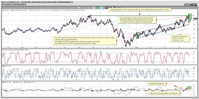
Why classified under The Good? Just take a look at the HUI Index chart, take a look at the steady rise never failing to break from beyond its original trend channel from where it started early on in January 2009. Not only that, this week we came $2 dollars short of reaching the all time high. I'd say that qualifies as strong performance. The failing to break the all time high is like I said, just that, stocks don't have to break all time highs in one straight move. Maybe one, two or three attempts.

At least that index managed to get back to earlier highs.

Now on to gold...do the terms 'historic gains' mean anything? I don't really mind the little bumps or a possible correction, what must be done must be done. Like with the HUI, this will just be a correction, not the start of golds downward march to 984.

The Bad

S&P Daily Chart
S&P Daily Chart December 04, 2009
Chart is courtesy of marketclub.
Marketclub - S&P Index Trend Analysis Marketclub - S&P Index Trend Analysis (What's this?)

Nasdaq Daily Chart
Nasdaq Daily Chart December 04, 2009
Chart is courtesy of marketclub.
Marketclub - Nasdaq Trend Analysis Marketclub - Nasdaq Trend Analysis (What's this?)

Dow Jones Daily Chart
Dow Jones Daily Chart December 04, 2009
Chart is courtesy of marketclub.
Marketclub - Dow Jones Index Trend Analysis Marketclub - Dow Jones Index Trend Analysis (What's this?)

So, The Bad! What do these charts have in common? They all to me at least, show choppy performance, failing to reach earlier highs is one. Second is, they are all showing signs of a market in disarray. A market in doubt. Will it go higher or will it go down? A market that is tiptoeing along...every leaf, twig or little pebble will set off the noise and release the evil bloodhounds...leaving everybody running for the exits...so to speak.

Angel Eyes / The Bad / Lee van CleefMethinks, the debt package and stimulus money is running out...nothing like an inflated job report to try to stave off any possible drop. However, there is more needed than an inflated job report to continue this path.

I'm not convinced. I'd be careful, that's all. The Dow Jones even has a rising wedge in there which if confirmed does not bode well.

The Ugly

US Dollar Daily Chart
US Dollar Daily Chart December 04, 2009
Chart is courtesy of marketclub.
Marketclub - US Dollar Trend Analysis Marketclub - US Dollar Trend Analysis (What's this?)

On to the almighty Dollar, the greenback, the world-currency, the safe-haven,...at least, that is what it once was known as.

Tuco / The UglyAlmighty? NOT compared to what I can see from other currencies!
Greenback? Last time I checked they were still green.
World-currency? NOT for long!
Safe-Haven? NOT what I can see from gold's chart.

Summary

Now, I'm not per definition saying the markets are going down but I'm just stating and showing you what is on the charts. If they break those resistances then fine, none the wiser and we move on. However, if there does seem to be a reversal going on, then people and investors will, like they did before, take the money off the table. Will that money then go to the dollar or the treasuries...or will that money flow into gold, silver and the commodities?

We all know who came out on top in the movie,...don't we?


YeOldGoldNugget's links of interest

Wednesday, December 2, 2009

Gold's Relentless March Continues!

Gold Spot Daily Chart
Gold Spot Daily Chart December 02, 2009
Chart is courtesy of marketclub.
Marketclub - Gold Spot Trend Analysis Marketclub - Gold Spot Trend Analysis (What's this?)

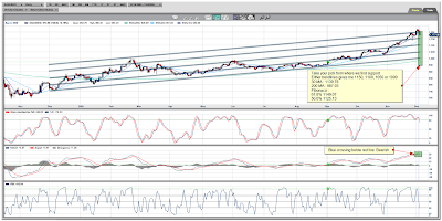
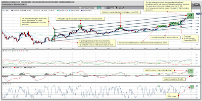
Since I did my last chart I've been doing some minor adjustments to my trend lines. Only minor ones as you'll see. Just compare the two daily charts for a moment.

Only difference is, the trend lines now align perfectly and every other one is 50 points away from the next one. I don't know whether this is a coincidence to have them lining up so perfectly but there are too many points to highlight on the chart which sorta rules out coincidence...at least to me.

For instance...the bottom trend line started November/ December 2008 at around 750 (low to be exactly 756,20 at December 07, 2008). Were we to follow that trend line until now we would indeed with the combined normal trading action have hit the 1000 mark around September / October 2009.
Also from the chart you will see the upper trend line being hit in February 2008, on February the 20th to be precise. If I use that high and draw a new trend line parallel with my other trend line and also at exactly 50 points from the lower one (the 4th), take a look where gold took a breather from a couple days ago!

On November the 24th I posted an alert on my stock-house blog to let my readers know that a possible dip was coming. You can now see why!

Sure, it could break the upper trend line straight away but always better to take some profits off the table. That way you have some funds available to buy stocks on the low if it does turn down.

On with the chart, you'll see that from the beginning of November gold has broken through several trend lines, three to be precise. Now, if you know that each channel represents 50 points than that gives you 3 x 50 which equals 150 points increase already since the beginning of November when we were still trading at 1050.

So, starting from 1050 in early November, 3 channels up gives us 1200. Now from the chart you'll clearly see that it broke short of the 1200 and after hitting 1195 started trading down. It was a quick pullback which coincided with the Dubai debt issue seemed like a very violent correction as it went down and hit a low of 1136, a little bit under the lower trend line. Gold was quickly brought back up again and together with the 10 MA as support was quickly making its way to the upper most trend line again and has since yesterday clearly broken it.

Gold Bar - BullionVaultTrading now around $1215, so definitely above the upper trend line which sorta leaves me wondering where this is going to end? In my last article I indicated getting to 1200 would be no problem. From the looks of things I'd say no problem indeed!

So now what?

Well, from the chart you'll see already on the daily we are a whopping $232 away from the Moving Average 200 ;-)
Don't know if this is a record or not since my charts only go back for 10 years but from what I can see on the daily in those 10 years....IT IS!!!

Does that mean I'm now looking downwards for gold? HECK NO!

No time to be betting against gold right now, no matter what RSI or MA tells you. At least, that's what I think. If mean, if you see gold moving up channel after channel, gaining 50 points in a couple of days and another 100 points over the course of less than a month with no signs of even looking back to the carnage it is wreaking havoc upon amongst those who are short.

Golden HAVOC!

So, does the daily chart please YeOldGoldNugget? A WHOLEHEARTEDLY YES! It is the relentless action of gold, the maybe historic gains gold is making now. Not simple factors to ignore, my 2 gold nuggets.

Gold Spot Weekly Chart
Gold Spot Weekly Chart December 02, 2009
Chart is courtesy of marketclub.
Marketclub - Gold Spot Trend Analysis Marketclub - Gold Spot Trend Analysis (What's this?)

Weekly is where gold does its magic! Is it magical? Well, can't you see the magic going on in the weekly chart? I sure can!

Again, mind you, I can only look back 10 years in market club and from what I can see gold has never seen such strong performance like it has these last two months. Absolutely amazing to say the least!

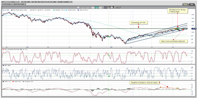
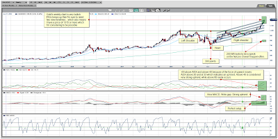
From the chart you can see we are still or could still be completing our head and shoulders pattern which we broke out off from the beginning of October 2009, That alone gives us a long term price indication of about 1300 to 1350.

Looking at the MACD,...if ever someone needed to write a book and describe one of the most bullish of MACD's then surely gold's MACD or something similar would be shown. Blue line above red line, wide gap ever increasing, steady increase is also shown in the gray divergence cubes which increase steadily over time. That is just what one needs to see and will always see when a stock or index is undergoing a strong uptrend.

I've added another indicator, the Average Directional Index, this can determine trend strength regardless of the market direction. This non-directional oscillator is based on a range of 1 to 100 (although movements over 60 are rare). If the line is under the 20 mark, the trend is considered to be weak. If the line is above the 40 mark, the trend is considered to be strong. The ADX line is built on the results of two separate technical indicators, the +DI (force of up-moves) and the –DI (force of the down-moves). The default for this study is 14 periods which takes into the consideration the measurements of the +DI and –DI for the last 14 periods.

Knowing that and looking at gold's ADX chart you can clearly see the +DI above the ADX which indicates a trend upwards. ADX is also looking to go higher.

Gold Bar - BullionVaultIf gold keeps up its relentless action which it, looking at the weekly chart, is bound to do then by February 2010 we might already be looking at 1300 or more.

Stranger things have happened.

I think we have a clear winner here! Gold...and silver...bound to astonish most and catch many off-guard and with their pants down.

To finish my article I'll give a couple supports daily and weekly.

On the daily we have support from either the 10 MA at 1184, the 30 MA at 1129. I'm disregarding the 200 MA (984) for obvious reasons. Of course, there are also the trend lines to look for to offer support, 1200, 1150, 1100,...

On the weekly we have support (and also from the trend lines) from either the 10 MA at 1096, the 30 MA at 1002. I'm disregarding the 200 MA (788) for obvious reasons.


YeOldGoldNugget's links of interest

Sunday, November 15, 2009

Orko Silver Chart November 13, 2009

Orko Silver Daily Chart
Orko Silver Chart November 13, 2009
Chart is courtesy of marketclub.
Marketclub - Orko Silver Corp. Trend Analysis.

Friday the 13th! Truly a unique day since it occurs at least once, but at most three times a year. 2009 turns out being a super year for Friday the 13th's since we've had three this year, one in February, March and November.

When we look at Orko Silver's Friday the 13th's...strangely on both previous occasions, the next trading day following the 13th saw a lower low while Friday the 13th itself saw a higher high? That must be some odd coincidence? Check the chart, on every Friday the 13th you'll see we hit a high of a rally and the next trading day we went lower. The lower candlestick is easily visible in February, it is the blue candlestick with the long lower wick and in March it is the red candlestick in the middle. The candlestick before each of them is the Friday the 13th one.

Enough with the superstition. Time to look at what the chart is telling us. As you will know of course, the daily is used to get a short term look or to better find an entry point into the stock...while the weekly chart is used to spot the trend...which in Orko's case is up by the way.

The last couple of days Orko has been battling with the 1.00 barrier and has since last Friday sorta crossed it or rather closed at it ;-)
If this were a border dispute, I'd say there have been many attempts to cross the border and head for the inland. The more attempts the higher the probability of breaching, that is just pure mathematics. Same goes for Orko Silver.

Of the previous 2 months, Last Friday was in a way the third attempt to breach the 1.00 barrier. Now, Orko Silver has set up camp at the border again.

Now, previous attempts where lacking in some departments. This third attempt has in a way a lot going for it. It still has a Cup and Handle which could get completed,...if the market so desires. We have an emerging double bottom pattern emerging starting mid September, I've highlighted this on the chart by using the red arrows, which follow a W-shape which forms the double bottom. The double bottom is there but this one does not comply with all necessary points needed to qualify as an actual double bottom.

All in all, last couple months saw very decent volume and certainly when compared to the months July and August. Things are definitely picking up. Next trading weeks should bring us further above 1.00 and establishing a definite breach of the under 1.00 figures.

Orko Silver Weekly Chart
Chart is courtesy of marketclub.
Marketclub - Orko Silver Corp. Trend Analysis.

As you can see from the weekly chart, we are definitely in an uptrend. MACD is again above the center line and trading upwards. From the chart you can see we are trading above all the Moving Averages so, above the 10, 30 and 200 MA.

I've added some other points on the chart which I would have used to enter or exit the stock. Might be of use to you when trading other stocks. The sell point of 1.80 was obvious, we've had the 10 MA crossing below the 30 MA and going lower, besides that, the earlier trading days saw lower and lower closes. We've had a last up burst but the very next day again a confirmation of wanting to go lower so a perfect time to get out.

I would have bought again at 0.40, mind you I have to tell you, I am a bit more of an aggressive trader so safer would have been to have waited for the MA crossover which meant getting in at around 0.60. But that would have left you with some very cold feet in July and August since the stock went back to those lows.

So always look at the weekly chart. That would have told you that ditching your shares around 0.60 probably was not the smartest of things to do.

Where are we now? Pretty much the same as the daily but with stronger confirmation of trend...which is pretty much up. I'm looking for a continuation of the current trend and thus higher grounds for Orko.

If I see any change in action I will post a quick summary.

Last week's highlight taken from Pan American Silver's last news release :

Pan American has built or expanded and commissioned five new projects in the last six years and its eight mining operations are performing as expected. The Company is now focusing its development efforts on the La Preciosa silver project, in Durango, Mexico. Pan American and its joint venture partner, Orko Silver Corp., announced earlier this year that a comprehensive exploration and development program is currently underway on the plus 32,000 hectare property. Pan American's goal is to complete a feasibility study and be positioned to make a production decision for La Preciosa by the end of 2010.


YeOldGoldNugget's links of interest

Wikinvest Wire


Watch INO TV for FREE now.

Orko Silver Corp. Chart


MarketClub Free Trial - Tools for the Trader

24 Hour Spot Silver (Bid)

Live 24 hours silver chart [ Kitco Inc. ]

Buy Gold Online - BullionVault

Buy gold online - quickly, safely and at low prices

Educational Videos - Market Analysis

Watch the latest educational videos from MarketClub by Adam Hewison